Process:
🎨 Created: Jan 02 2022
🏁 Completed: Mar 01 2022
📌 Category: Native mobile app design
⏳ Timeline: Jan 1st - Mar 30th
🌐 Context: Client project
🔨 Tools: Figma, JIRA, AfterEffects
Role:
🧩 Understanding the business need
🧐 Competitor & user research
🧠 Design strategy & ideation
📝 Wireframing & Prototyping
The challenge:
For TODO, we needed to fundamentally understand what hindered the frequency and amount of local events in South Africa. We needed to contextualise these points so we could provide services for our users to search for and advertise small to large scale events, while also allowing for the management of users.
The platforms for our three main user types are as follows:
Data management portal
Advertiser platform
Event attendee platform
The solution:
In response to the challenge, my team and I went to work understanding our user and business needs, while working with our in house team of developers and project managers to deliver incremental designs to the client that could easily be revised weekly.
Our main approach to the solution was to join the advertiser and event attendee platforms, so that we could achieve an easier way for users to switch between the two main user types as they please, and allow for these user types to have a support structure that is the data management portal in case they run into any platform related issues.
Contents:
💢 Understand
Context:
This was a client project where I lead design decisions and conversed with stakeholders to come to the final solution. I worked with a product strategist to understand the context and scope of work provided by the project manager, where we provided research and findings to inform our design decisions that could then be factored into our wireframes in a way that was dev friendly and answered our client & user needs.
Working in a team this large was intriguing, as I was being pulled in many different directions to make sure I was cognisant of development complexity in features, making sure API’s were integrated in the right ways and at the right times for a more seamless user experience. I found it particularly fun to build a relationship with our client, who was wonderfully attentive and provided ample trust and feedback in the type of work we were providing to them, and in turn we would take into account their feedback for the refactoring of design decisions where applicable.
All of this needed to be achieved in the space of a couple of months; our timelines were set, we stayed on track, and delivered meaningful designs to our product manager who helped us stay up to date with everything pertaining to the project scope.
This was also an opportunity for me to mentor and manage an associate designer who helped me wireframe and prototype the project, who then later took over the project from me as I shifted to new products.
We began this process by doing the following 🏋️♀️
🔬 Industry research:
The approach we took at the company was slightly altered to the way the UX process would normally go, we did our research in a condensed form called a “product canvas“, which helped us rapidly gain insights and maintain a Figma file that highlighted all the relevant insights that we needed to inform our design decisions. We began with industry research for TODO.
📝 Industry description:
Event management is an industry that has recently taken a hit during the time of the COVID-19 pandemic, but as restrictions settle we are seeing a trend back to events that are more reminiscent of normal life. Event management is dependant on advertisements to allow for possible event goers to be aware of and sign up/ buy tickets for events.
Events usually follow a categorised structure that allow people to filter and sort through topics that apply to their specific interests, advertisers leverage on these event tags along with location data to get the message out to potential event goers. Advertisers also make use of social media and other services (multiple of the above forums) to spread the word to their market. This is the main premise of the app TODO, to show people with specific interests which events are happening nearby.
🥅 Purpose of the industry:
Event management and advertisement is key in collecting large groups of people and organising them so they may meet at a specific time and place. Many events are monetised so the event manager/ performer/ shop-keeper/ anyone working at the event is able to generate revenue from event goers. The key aspect of the industry is to gather people effectively so the events can be successful in achieving their monetary goals. Some events are purely driven by interest, meaning they may not incur any costs from event goers, but simply wish to get together with like minded folks and have a good time.
👀 Observe
Competitive analysis:
Sadly we did not have capacity or scope to carry out remote user research interviews, so instead we conducted a competitor and feature analysis that I believed would help uncover my questions about how people interact & behave with browsing events and advertising events. How far are people willing to travel, how do users view advertisements, how can we deliver advertised content in a way that does not come off as spam?
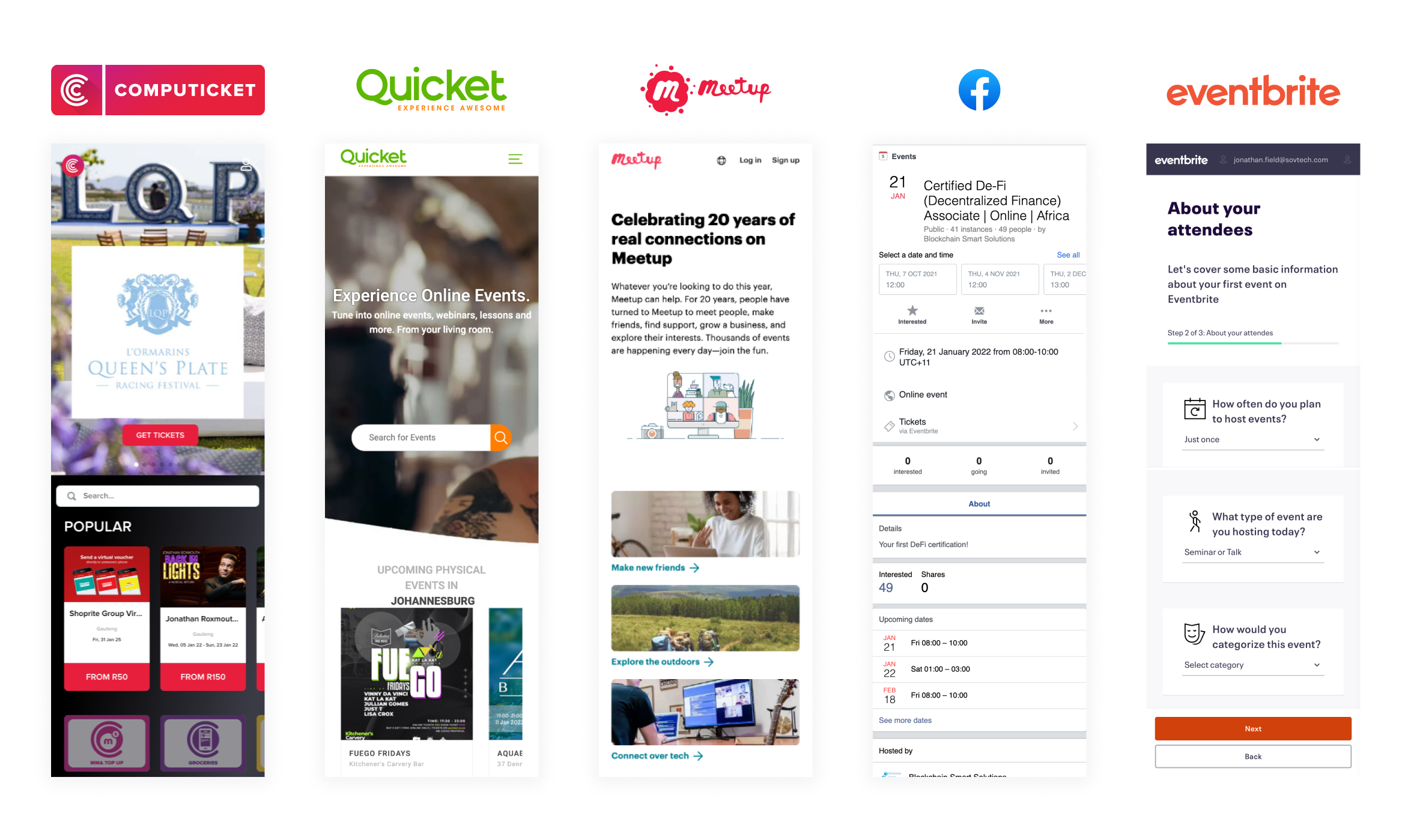
This resulted in the following competitor analysis:
🔴 Computicket:
What they do well:
Card layout for events are clear, colour coded and incorporate images.
Cards include the simplest form of info (price, date, name, location).
They have a basket feature that allows users to store and keep track of events they like/ want to refer to later.
They have a google maps integration for users to see events on.
What they can improve on:
Filtering features for the map view are too linear and difficult to spot/ read/ use... Users have far too many location choices in dropdown, and they cannot bulk select event types in the filter.
Price range slider in unreadable.
Illogical placement of back buttons and age caps are listed at the very bottom of a page where users are less likely to see it (this may be a marketing trick).
🟣 Meetup:
What they do well:
They show the popularity of events and communities at a glance by showing how many people belong to specific circles, prompting users to inquire further and potentially join.
They allow for some events to be private.
Users are able to click “see similar events” which will afford them the option to bypass filtering and hone in on focused content.
There is a great unauthenticated view for users before sign up is prompted.
What they can improve on:
Their spacing is off and the tags they use to allow quick access for users to view relevant topics span the page in strange ways that make it tough to navigate the website.
Buttons for sharing are not labelled, which is inaccessible and can make it difficult for some users to find.
Filtering in mobile becomes trickier, the fields are horizontally scrollable which forces users to put in extra work when the filters could be condensed in a way that has them all visible or hidden in a “Floating Action Button”.
🟢 Quicket:
What they do well:
Clean and easy to navigate website with the search feature front and centre.
Filters are all bulk action, there are a manageable amount of filters for each section (date, category, location), so users will have full granular control over what events they see.
Events that deal with music have a Spotify integration for users to get a taste for music styles.
What they can improve on:
The events page relies on a singular list and pagination, instead of organising the information in a condensed manner and enabling more horizontal scrolling or infinite scrolling.
Their photographs do not respond correctly to the screen size in mobile.
The location feature is a simple image, which does not promote further interest in other events that may be nearby, and does not allow users to directly zoom out in the app (instead offers them the option to “view directions”).
🟠 Eventbrite:
What they do well:
Allows users to “like” events, which goes toward a trending feature that shows popular events first.
There is a CTA right on entry to the PWA that allows users to “get started”, this allows users to go to a personalised page set for their residing city, which showcases local events.
The UI of the app is bright and clean, with information pertaining to specific events listed in logical proximity to their parent image, while categories of events are arranged in a natural horizontally scrolling fashion.
Creating an event is simple and asks users onboarding questions in a logical way, where they individually input information pertaining to the event when it’s necessary (placed in large groups: time, attendees, location & event name/ blurb etc).
What they can improve on:
Foreign currencies are listed under some events, which may be a deterrent for some users or cause confusion (this may be because eventbrite is a foreign event manager, so there are only a handful of available currencies that users can pay in, this would be managed by PayPal if foreign bank accounts are not an option for users).
Headings for event information tend to blend into the actual content, spacing is a small issue.
Sharing options are set up in a haphazard way where icons are squished together instead of aligned and set in a neat area that uses sharing information logically.
🔍 Point of View
User personas:
The competitor and feature research allowed me to create some assumptions around our user types, I then went on to research our three main user types and eventually collate all the information into some personas for us to contextualise how our users might use each platform.
Firstly I went on to identify the user type, the assumptions around the user type, the research findings, needs identified, and lastly, the key takeaways.
🙇♀️ I found it quite difficult at this point to make assumptions that were not validated via user interviews, while following the processes of the company I came to understand the need to save time and money sometimes trumps the UX process.
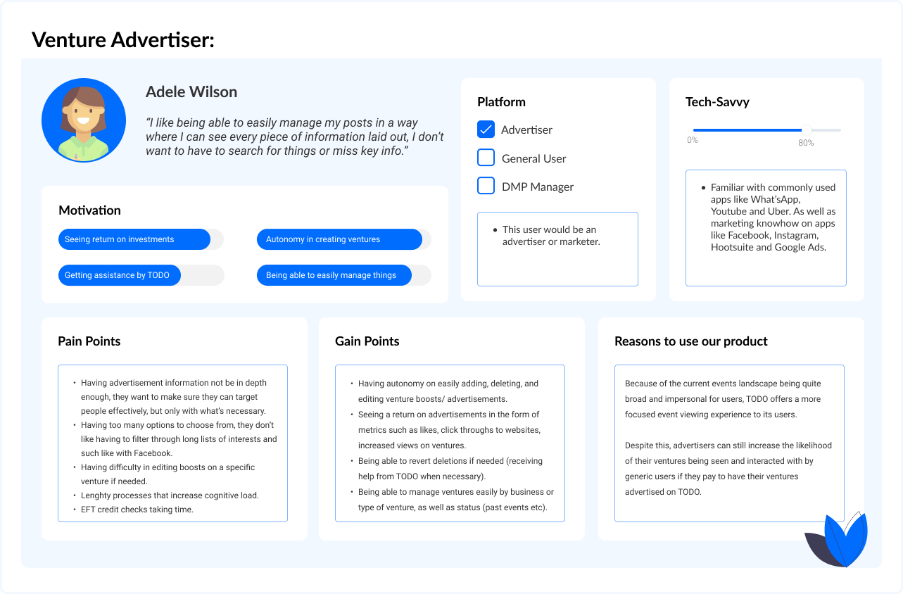
User type 1 - Venture Advertiser 📢
🤷♀️ Assumptions:
Advertisers will want to access a range of different attendees for their ventures and will need differing levels of distance available to them so they may focus/ localise their searches for attendees.
Advertisers don’t want to access attendees from everywhere, as this leads to false metrics on popularity of the venture and the actual return in ticket purchases and attendees going to events can end up underperforming.
Advertisers are willing to pay large sums of money to boost their ventures.
There is no vetting process for advertisers other than a payment cap that filters out underage people.
🕵️♀️ Research Findings:
We found that there are several types of advertisers, or rather, advertisers with different motives:
Businesses: Individual businesses will depend on event marketing in order to reach the people they need to. Tech businesses, event managers and workshop hosts all utilise this tactic in order to reach people that apply to their like interests (UX Bakery is constantly marketing tech events and seminars on Instagram, Trance party managers are constantly marketing the next event on event pages and social platforms too).
Individuals: Sometimes the average joe will want to create an event for something, maybe they recently volunteered somewhere or are tyring to run a charity workshop or school function to make money. This means that they will want to potentially get the word out in their communities in any way they can.
Agencies: Agencies help multiple businesses manage their social media and event marketing efforts, they are in the know on best practices for event audience targeting and often have full autonomy on how they go about advertising or boosting posts/ events.
Groups: Societies and large groups of people who like to get together to do events will sometimes take it upon themselves to invest in an advertisement or boosted event post, this allows for more reach to people they may want include in their community (e.g. Rock Climbing gyms like to grow their communities and get together for movie nights, challenges and outdoor retreats... newcomers are always welcomed to the growing community).
🌱 Needs Identified:
Advertiser user stories:
As an advertiser, I need a way to quickly update ventures into advertisements so I can market and sell tickets to my desired attendee base.
As someone who needs to market an event, I need a way to easily boost my existing ventures so that I may see a higher return in attendees signing up to my venture.
As an advertiser, I want to sell more tickets to my ventures, so that I can make more money and run more successful events.
As an average person starting a venture, I need to be able to advertise cheaply and quickly so that I may gather more people from my community to my venture.
As an agency, we need to be able to easily manage boosted ventures so that we don’t loose track of all the different advertisements we have going on (view advertisements by business, groups, past, recurring etc...).
🔑 Key Takeaways:
Advertisers come in all shapes and sizes, they will need different needs met depending on what kind of advertisers they may be, some people will need to manage large numbers of advertisements while others will be doing one advertisement every few months. There are needs for advertisements of ventures to be categorised in a different way here, not just by event categories, but by business and status (past, ongoing, future).
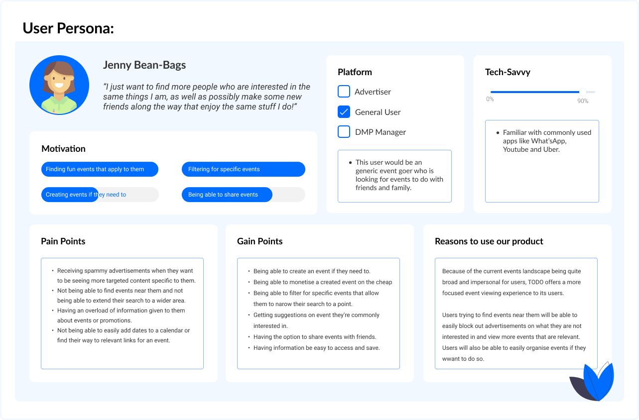
User type 2 - General User 🙋♀️
🤷♀️ Assumptions:
Users will want autonomy on how many/ what kinds of ads they see, giving them the choice to view ads or not (TODO can advise to users that ads will not be spammy, but the option should still be there).
Users will be interested in doing the mental work to search for events nearby.
Normal users will want to advertise events occasionally, they do not have to be part of a business or agency.
Generic users will want to like, share and save events that apply to them.The end user will need to filter events in the map view, in the search feature and in any other applicable areas there may be a consolidated list of events in view.
End users will not want to see events that do not apply to them.
🕵️♀️ Research Findings:
We found that there are several types of advertisers, or rather, advertisers with different motives:
Date & Time: Users will need this information as a given, it’s the bread & butter of any event, when searching for events users will be on the lookout for the date and time of events that suit them best, so having events be listed within a reasonable time frame is key (perhaps suggest optimal timeframes).
Date & Time: Users will need ways to remember events too, possibly adding reminders or allowing users to import an events details to their calendar so they can remember more effectively will be worth it for TODO
Place: Users will need ways to get directions, view addresses on a map directly, link through to Google Maps, save online meeting links to their calendar and more.
Cognitive Load: Users will experience an overload of information when searching for events to do in their area, so information should be laid out in ways that streamline the viewing process for them (horizontal scrolling achieves this, as well as category groupings so users can quickly flick through info & content).
Cognitive Load: Users will only pay attention to the most key info they are looking for, everything else will fall back into static noise by default, as a result it’s up to us to deliver this key information in a way that makes it less effort for users to ingest. Clear CTA’s and sections of information that folow a predictable and consistent pattern will allow us to achieve a quick-to-process view of ventures for our users.
Filtering: Users will need a way to filter by several different data points, including location, price and category.
🌱 Needs Identified:
Advertiser user stories:
As a forgetful person, I need a way to save an event for later or save an event to my calendar so I can be sure to not forget when it happens.
As a young person, I want to be able to quickly view event details in a way that helps me gather information as fast as possible so that I can quickly decide if events are applicable to me or not.
As a person with particular interests, I want to be able to easily filter out events that I have no interest in so that I can be less distracted by frivolous information.
As a person who wants to host a party, I need a way to create and share a free private event so that I can enjoy time together with my friends.
🔑 Key Takeaways:
Our end user, who makes up the bulk of what will be our entire user base, is primarily going to be on the lookout for local events that are applicable to their interests. As such, they will want to be able to filter for things that apply to them so they can reduce the cognitive load on themselves.
These users will also need ways to integrate events into their calendars for reminders, and will need ways to easily check maps and click through to ticket sales if they happen to want to commit to a particular event. These users will also potentially be creating events, they are most likely to b small scale events between family and friends, but we cannot rule out the possibility that they will not want to monetise an event (so they should be able to easily do that, as it will increase TODO profits).
User type 3 - DMP Manager🙋♀️
🤷♀️ Assumptions:
The DMP managers will be using the companies “Core”, so they will need to learn how to use the software to effectively allow them to do the work pertaining to advertisements and event management.
DMP users will be in contact with people who need help.
DMP managers will be in contact with users that need help.
DMP managers will need to manage large amounts of data that relate to event locations, destinations and categories (making sure things are within the correct parameters if they aren’t automated).
They will have the authority to revert accidental deletions of events, and will have the authority to delete or cancel events that do not meet the correct parameters set out by TODO.
🕵️♀️ Research Findings:
We found that there are several types of advertisers, or rather, advertisers with different motives:
DMP managers: They will know how to help users and advertisers achieve their goals.
Power: They essentially have all the power to delete, un-delete and vet any event or advertisement, as well as the users & organisers themselves.
Training: They will have training in the company “Core DMP” and its custom actions relevant to TODO features.
🌱 Needs Identified:
Advertiser user stories:
As a DMP manager, I need a way to easily sort through events that have been flagged as inappropriate or bad for community health so I can avoid uncomfortable users and possibly dangerous events.
As a DMP manager, I want to be able to help users through a request system so that I can help retain customers for TODO and increase the companies revenue.
As a DMP manager, I need to be able to have the autonomy to undo accidental deletions or critical errors in a users event or advertisement so that I can help our users achieve their goals.
🔑 Key Takeaways:
A DMP manager will likely be helping users, and advertisers alike, while helping manage content and data from the backend. The DMP manager will have authority to reverse accidental actions made by users or remove possibly harmful content from TODO if need be.
🤔 Problem Statement
🙋♀️ Event attendees
TODO users need a way to create and view events that are applicable to their specific interests,
because they want to either grow their community, host events, make money selling things or just do something fun.
We will know this to be true when we see users effectively search and sign up for events that pertain to their interests.
📢 Advertisers
TODO users need a way to create and advertise events for specific categorised groups,
because their goal is to host successful community events and generate revenue.
We will know this to be true when we see positive feedback from event goers and positive return on investments via the TODO platform.
👨🔬 Hypothesis Statement
🧭 We believe that by creating an application with a joined advertiser and general platform that can create ventures, keep track of ventures and advertise ventures,
for advertisers and general event attendees,
we will achieve their need to both view, keep track of, and attend events, while allowing for the flexibility of becoming an advertiser that can then monetise, distribute and track events for multiple outlets while still being able to attend events too.
🧠 Ideate
Feature flows:
At this point I had a few ideas for how to set up the app in a way that addressed user needs, we moved on to our feature flow and user journey portion of the design sprint, where we fleshed out the information architecture of our application.
NOTE: We did not have to account for the design of the data management portal, as we were using the company approved “Core“ DMP, which was already built.
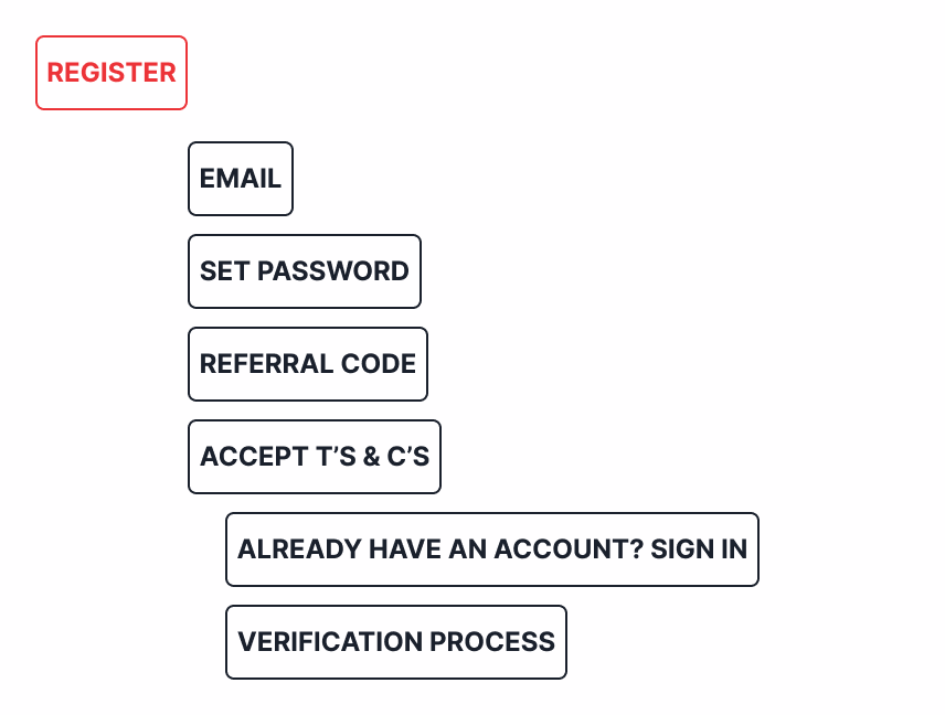
Task analysis 1:
Registration.
🏁 Entry point: Accessed after the walkthrough and unauthenticated home page view.
🎉 Success criteria: Successfully register users in a simple and effective way that minimises user drop-off rates.
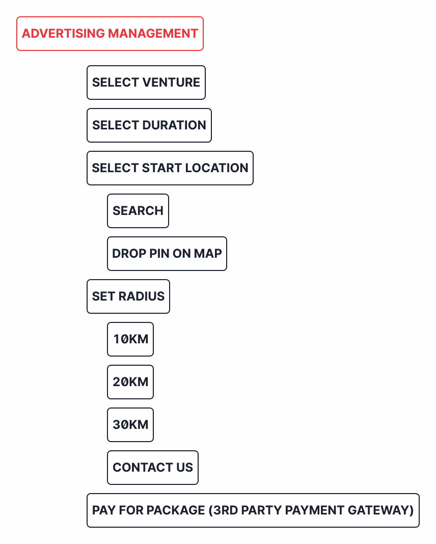
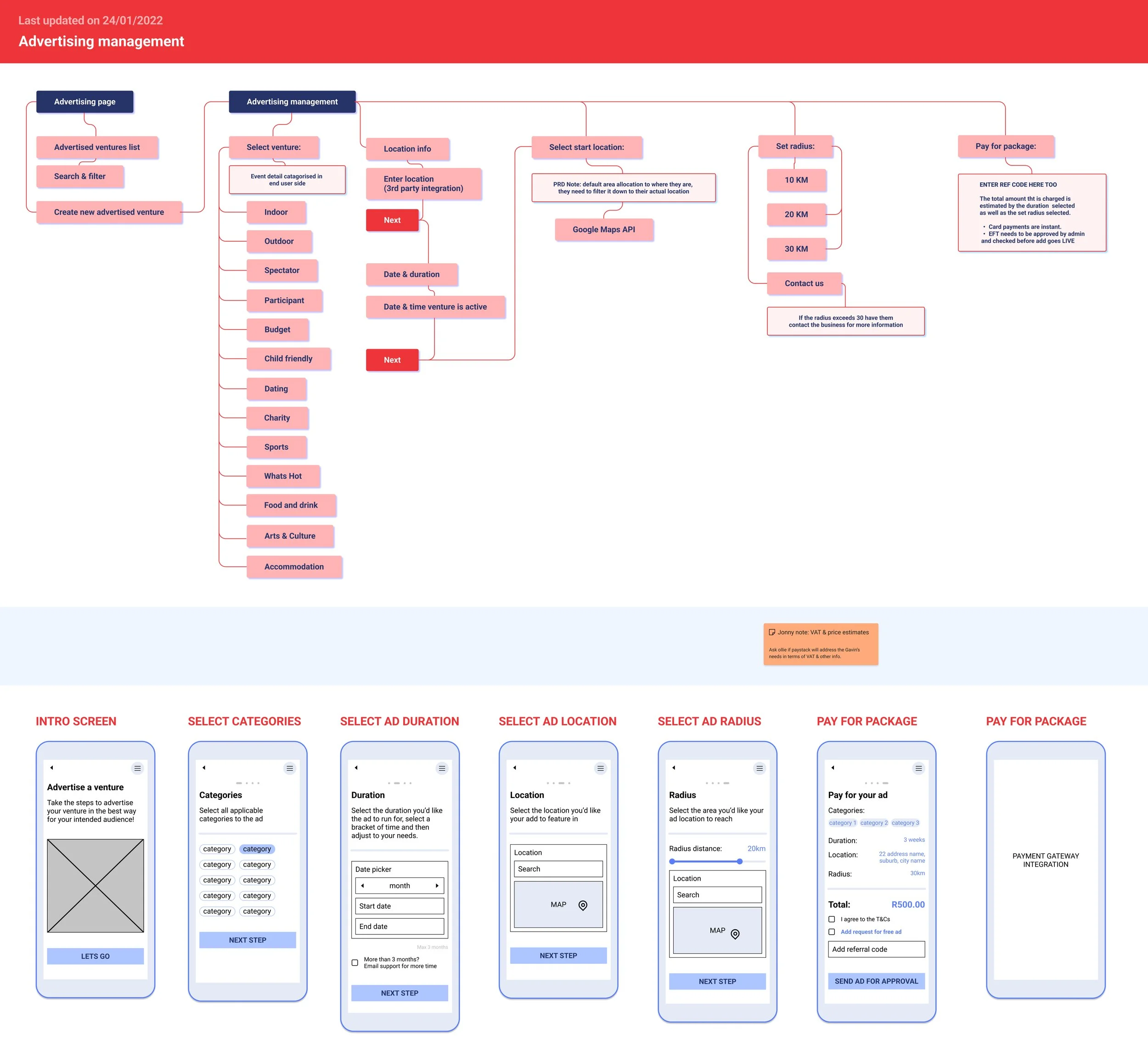
Task analysis 2:
Advertising Management.
🏁 Entry point: Via the “advertise“ icon in the bottom nav.
🎉 Success criteria: Allow advertisers to easily create, read, update and delete advertising content.
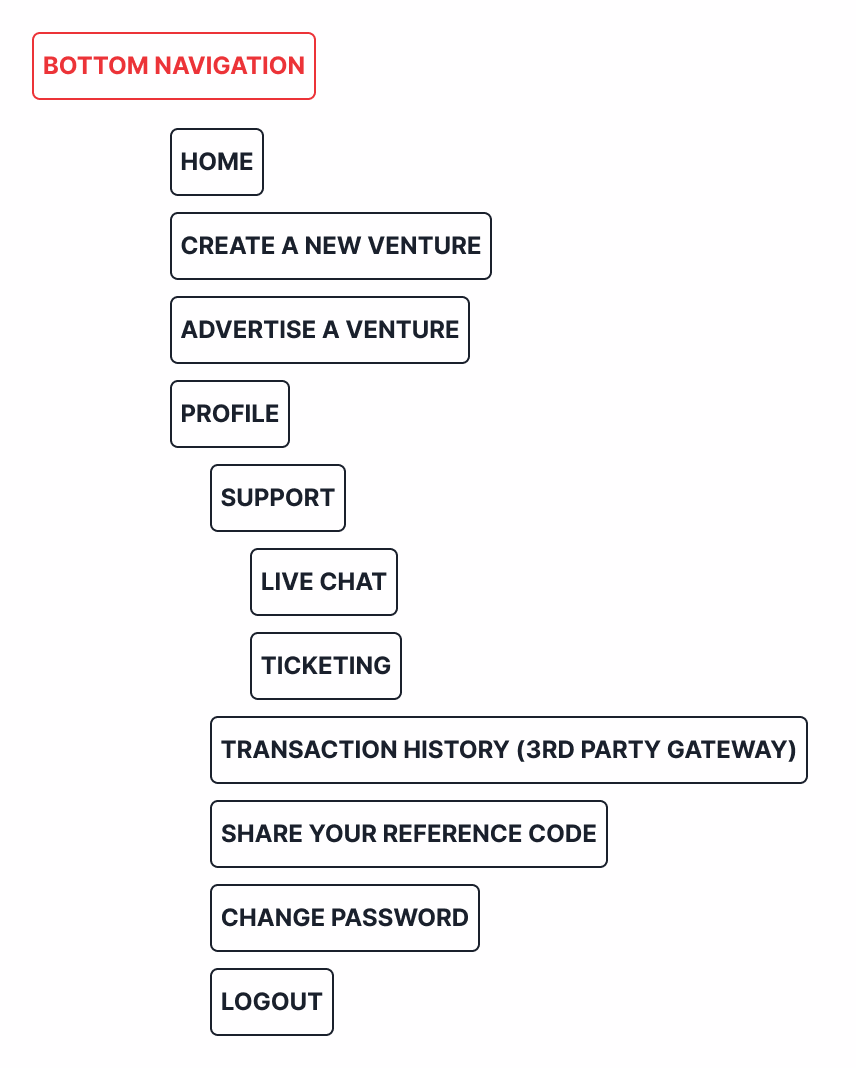
Task analysis 3:
Bottom Navigation.
🏁 Entry point: Always present on screen.
🎉 Success criteria: Provide the users a way to access all points of the native app with ease.
User journeys:
The feature flows were then expanded upon to create more detailed user journeys, which were then further elaborated upon to create some basic low fidelity wireframes. These include backend prompts that show how user actions influence API’s, data management and more.
Interface Identity:
In tandem with feature flows and user journeys, we put together a document called an interface identity. The goal of this is to provide the client with pre vetted options of colour and UI element styles that we as the product designers believe would help answer user needs best.
We presented these options to the client, and came to the conclusion to use the purple swatches as a base for a dark mode UI look & feel.
We also provided the client with several logo animations to choose from.
Use the “Z“ key to toggle the view if it does not fit.
Use the arrow keys “<“ & “>“ to toggle the next & previous page .
📱 Prototype
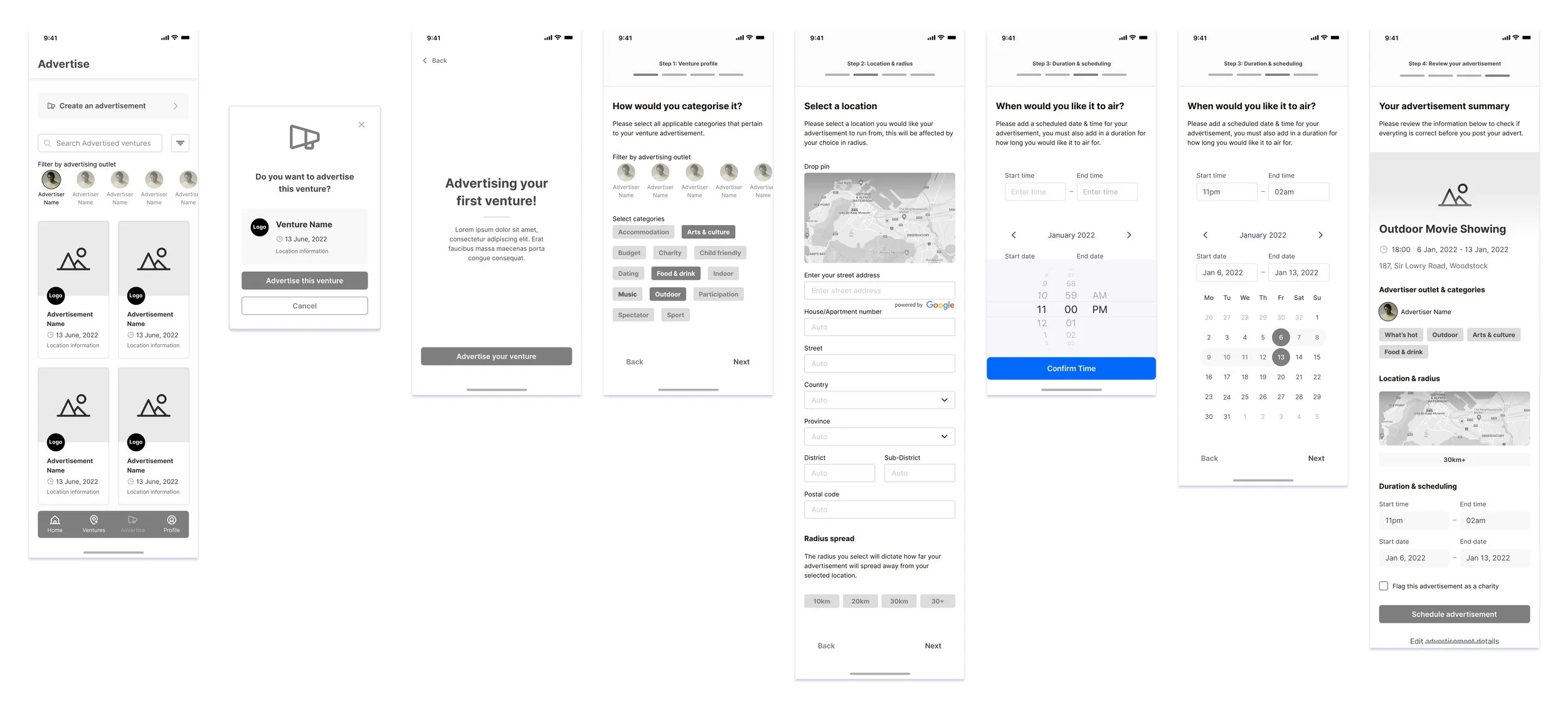
💻 Here is a progress flow from low fidelity to high fidelity wireframes that illustrate the growth of the product from conception to final UI.
Low fidelity wireframes:
As a standard in the company, we do not approach low fi wireframes with sketches, much to my displeasure! Occasionally I would do a quick sketch if I needed to rapidly solve a particular flow, but since we used many predetermined standard flows for features like registration and payments, it was not always needed.
Here are some digital low-fi’s! 🎨
Mid fidelity wireframes:
After outlining the best features & ideas to carry through to the next iteration of wireframes, my strategist and I established what would stay and what would go from our initial wireframes.
🧱 At this point I started using design system elements from Untitled UI & Chakra UI design systems. I also LOVE to play around and make my own component variant sets that make use of Figma’s “smart animate“ & “auto layout“ features to enable powerful UI arrangements and realistic prototypes that are also easily editable!
I had good fun creating these screens 🎉
High fidelity wireframes:
This was the point where my colleague, an associate designer at the company, joined onto the project and assisted me greatly with the finalisation of the UI and the feature patterns in the wireframes.
I loved working in a team and providing leadership to another designer, as it proved very useful to have help on the project.
I relished in my time working in a team, we stayed ahead of schedule consistently and provided ample value to the client while keeping our users and research in mind at all times. Both of us helping each other be accountable and making use of best practices as we worked. 🚀
💡 Present
Final UI Presentation:
We did not get to test this product before we handed over final designs and our playbook of styles, fonts & effects to our development team, as it was not within the scope to which the client subscribed.
This was a pain point for me because I feel we could have gained many valuable insights on how to rework the designs to answer user needs more effectively.
This actually came back to bite us later, as the development team were able to see some discrepancies in our design consistency and features that would have been easily editable and more beneficial for the user.
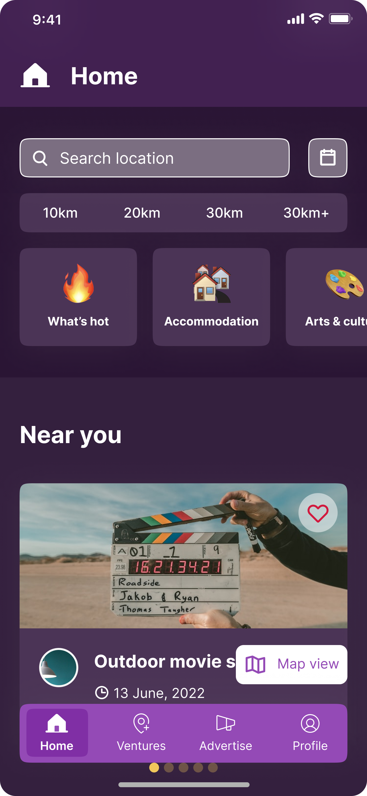
We came to the following final UI based on the client’s choice of styles:
High fidelity prototype:
The high-fi prototype was an effort to pull through to its final stages, we made use of several different prototyping techniques that are available in Figma for enabling tooltips, scrolling horizontally and creating micro-interactions that made the experience seem more realistic.
How did we get to this point? My colleague and I took. the interface identity choice from our client and integrated in into our Figma design file colour styles and typography styles. This made it easier to edit bulk changes in style while keeping proper contrast and hierarchy with colour.
We made use of cards and filtering options that exist directly on the home page for easier access, this has slightly changed from our low & mid fi wireframes as we needed a way for users to be able to access maps, date, categorise and search separately. This is also the point at which I left the project and my colleague took over all further iterations.
You can see how this all amalgamated into a holistic app prototype below.
I hope you enjoy the journey!
✨ Lessons Learned
Handling client pushback:
There were times during the project that proved quite difficult, one of these items was client pushback on advertising information that would have been an ideal data point for advertisers to use in their analytical reports and next steps for future campaigns.
We, as a team, advised against the removal of gender information from the onboarding flow, as there are a standard amount that are usually asked for, and giving users the freedom of choice allows for users to be seen.
This information offers advertisers a look into their market, allowing them to pivot to their needs ad possible create more effective events in the future.
There was a hard no given by the client here, so as a company we decided to not press the issue further despite our user advocacy, which was a bitter pill to swallow. 🤯
Make it accessible:
Something that we constantly had to keep in mind during this process was the massive target audience of the app. We had youngsters that wanted to attend festivals, middle aged advertisers who wanted to sell an experience, and older people who may want to gather for community efforts.
Attempting to create an accessible application for all of these people was a challenge, and I’m not entirely certain our MVP answers all their needs, which is why I feel testing and more research is definitely warranted.
I sincerely hope we get the budget and freedom to action these points. 😵💫
Work with your team:
My team was my rock during this project, even though I essentially owned this project and carried it through to development.
But working with my strategist and the head of UX research really helped me feel more at ease with my design decisions, and they would let me know when they had an opposing or parallel view to the solution.
The other designer on the project was my partner in crime during much of the later stages of this project, and I thoroughly enjoyed onboarding him onto the research phase and helping him learn more about Figma’s auto layout & smart animate functionalities as we created more in depth wireframes together.
Going back to solo work almost felt like losing a limb, team work is definitely my preferred approach to design, and the prospect of working entirely solo again made me feel a tad somber. But we press on nonetheless! 🏋️♀️
